Brand guidelines
How Tafra looks and sounds. This page shows the rules in DESIGN.md. It does not add new ones.
Download brand kit01
The idea
طفرة (tafra) means a leap, a sudden boom, a mutation. In everyday Gulf Arabic it is a jump that changes everything after it. In English we explain it as an anomaly, the thing that breaks the pattern.
Everything stays aligned except one slip.
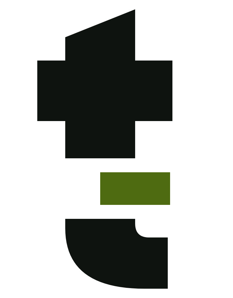
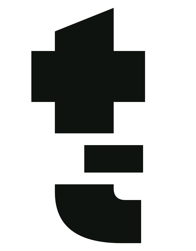
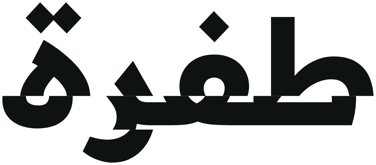
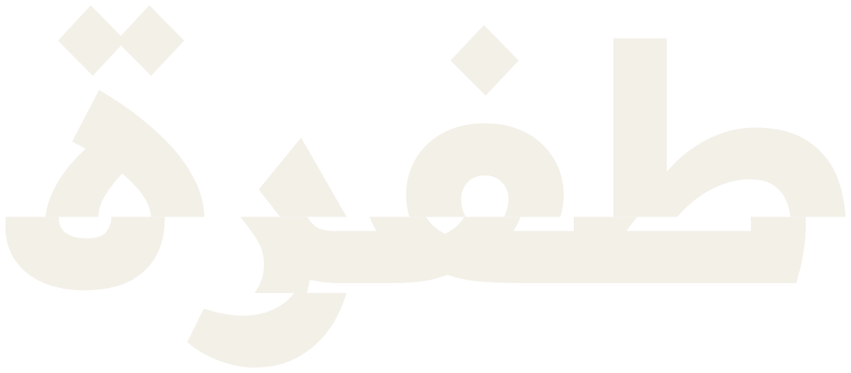
Layouts are calm, aligned and mostly dark. One element per layout breaks formation, and that element is what we want people to look at. The logo shows the same rule: the stem of the t breaks once and the broken piece slips sideways.

02
Logo
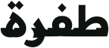
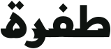
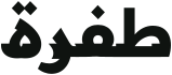
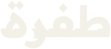
Use only the outlined files. Each lockup comes in five color variants, each for its own background.
- Dark, for Void, Graphite or dark photography. The default.
- Light, for Bone, white or light photography. The slip turns Deep Mutation.
- On lime, for Mutation surfaces. The slip stays as shape only.
- Mono black, for one-color printing, embossing and engraving on light material.
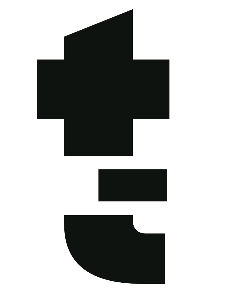
- Mono white, for one-color knockout on dark material.
Wordmark
The default for everything.




Monogram
App icons, avatars, favicons, small merch, anywhere under 80 px wide.


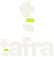
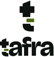
Stacked
Square formats such as social avatars with room, packaging and signage.
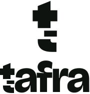
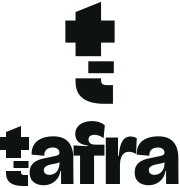
Bilingual
Materials for an Arabic and English audience at once, such as event signage and business cards.





03
Clear space and size

Keep clear space on every side equal to the height of the a in the wordmark, about 0.75 times the logo’s height. Nothing else enters that space.
- Minimum wordmark width is 72 px on screen and 18 mm in print.
- Minimum monogram size is 16 px on screen and 6 mm in print.
- Below 24 px, use the favicon file, which sits on a lime square for contrast.
04
Logo misuse
Each example below breaks a logo rule. Never use the logo like this.
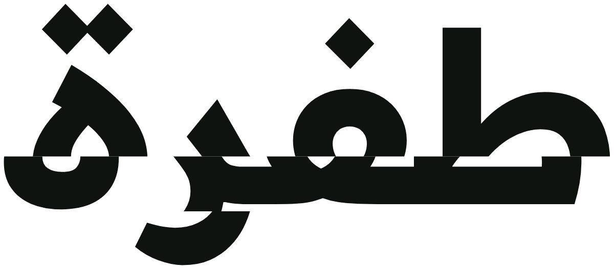
Do not retype the wordmark in a font.
Do not stretch or squash the logo.
Do not rotate the logo.
Do not put the lime slip on Bone or white. Use the light variant.
Do not recolor the logo outside the five variants.
Do not add effects, outlines, shadows or gradients.
Do not place the logo on a busy image without a solid panel.
Do not combine the Tafra logo with the Bravo logo into one mark.
05
Color
These values are fixed. A typical layout is about 60% Void, 25% Graphite or Bone, 10% Fog or Ash text and 5% Mutation.
Select a color to copy its hex value.
Main dark surface. Text on light surfaces.
--tf-void
Raised dark surfaces, cards, app icon.
--tf-graphite
Light surface. Text on dark surfaces.
--tf-bone
The slip. Accents, primary buttons, inverse panels. Dark surfaces only.
--tf-mutation
The slip and links on light surfaces.
--tf-deep
Secondary text on Void and Graphite.
--tf-fog
Secondary text on Bone.
--tf-ash
Contrast
Ratios use the WCAG 2.2 formula on solid sRGB values. Use only the pairs allowed here.
| Text on background | Ratio | Allowed for |
|---|---|---|
| Bone on Void | 16.45:1 | All text |
| Bone on Graphite | 12.53:1 | All text |
| Mutation on Void | 14.19:1 | All text |
| Mutation on Graphite | 10.80:1 | All text |
| Void on Mutation | 14.19:1 | All text, buttons |
| Fog on Void | 7.00:1 | Secondary text |
| Void on Bone | 16.45:1 | All text |
| Ash on Bone | 5.44:1 | Secondary text |
| Deep Mutation on Bone | 5.37:1 | Links, accents |
| Mutation on Bone | 1.16:1 | Never |
06
Typography
Bricolage Grotesque for display and headings, Readex Pro for body text and for every Arabic role. Both are free under the SIL Open Font License.
Latin
- DisplayBricolage Grotesque 800 · 56–120 px / 0.95–1.0 · −0.03em
- Most businesses fit the pattern.
- HeadingBricolage Grotesque 700 · 24–40 px / 1.1 · −0.02em
- Software for independent businesses
- SubheadingBricolage Grotesque 600 · 18–22 px / 1.25 · −0.01em
- Built in the Gulf, for the Gulf.
- BodyReadex Pro 400 · 16–18 px / 1.6
- Tafra builds software for independent businesses in the Gulf. Our first product is Bravo.
- Small and labelsReadex Pro 500 · 13–14 px / 1.4
- Our first product
- EyebrowReadex Pro 500 · 12 px / 1.2 · +0.14em
- Our first product
Arabic
- DisplayReadex Pro 700
- معظم الأعمال تسير على النمط.
- HeadingReadex Pro 700
- برمجيات للأعمال المستقلة
- BodyReadex Pro 400 · 1.7
- تبني طفرة برمجيات للأعمال المستقلة في الخليج. أول منتجاتنا هو برافو.
- Use at most three type sizes in one view.
- Left-align English text. Right-align Arabic text. Do not center paragraphs.
- Never letter-space Arabic, and never put Arabic in uppercase styles or eyebrows.
07
The fault
Cut one horizontal band through an element and shift that band sideways. The rest of the element stays where it was.
Break the pattern.
اكسر النمط.
- Use one fault per view. It is the accent.
- Shift right in Latin layouts and left in Arabic layouts.
- On type, slice one key word or short phrase through the lower third of the letters, from about 0.25em above the baseline to just below it.
- Shift by about 0.12em on type, or half the stem width on the logo.
- The sliced word may be lime on dark surfaces. Everything else in the headline stays Bone.
- On photos and shapes, cut one band 8 to 15% of the height, shift it 5 to 8% of the width and fill the gap with Mutation.
- Never slice body text, prices, numbers, names, legal text or anything people need to read exactly.
- Never add stacked slices, RGB splits, scan lines, noise or other glitch effects.
08
Motion
- The slip is the only signature motion. The band slides to its offset in 240 ms with cubic-bezier(0.2, 0.8, 0.2, 1), once, when it first enters the view.
- Hover and focus changes take 160 ms ease-out.
- No looping animation, parallax or bouncing.
- With reduced motion turned on, show the final state with no movement.
09
Tafra and Bravo
- Bravo is the customer-facing product. Tafra is the parent company.
- Use the Bravo artwork as supplied. On Tafra’s dark surfaces, place it on a White or Sky panel.
- Never merge the Tafra and Bravo logos into one mark.
- Do not mix Bravo’s cobalt, sky or yellow into Tafra layouts, except inside the Bravo logo panel.
- Describe Bravo only with the approved line, and link to usebravo.app.
Approved descriptionBravo is an online-store platform for independent businesses, beginning in the UAE and GCC.





10
Downloads
The brand kit holds every logo, icon, PNG export, the web fonts with their licenses, the tokens and DESIGN.md.
Download brand kitLogos
Wordmark
Monogram
Stacked
Bilingual
App icons and favicons
- tafra-app-icon-lime.svg
- tafra-avatar-lime.svg
- tafra-favicon-lime.svg
- tafra-app-icon-graphite.svg
- tafra-avatar-graphite.svg
- tafra-favicon-graphite.svg
- favicon.svg
- tafra-app-icon-lime-512.png
- tafra-app-icon-lime-192.png
- tafra-app-icon-lime-180.png
- tafra-avatar-lime-1024.png
- tafra-favicon-lime-32.png
- tafra-app-icon-graphite-512.png
- tafra-app-icon-graphite-192.png
- tafra-app-icon-graphite-180.png
- tafra-avatar-graphite-1024.png
- tafra-favicon-graphite-32.png
- favicon-32.png
- favicon-16.png